Plots I've Made
Here is a selection of figures I’ve worked on in my early career.

appears in: “Is the global economy deglobalizing? And if so, why? And what is next?” by Pinelopi K. Goldberg and Tristan Reed, prepared for the Brookings Papers on Economic Activity
tools: STATA
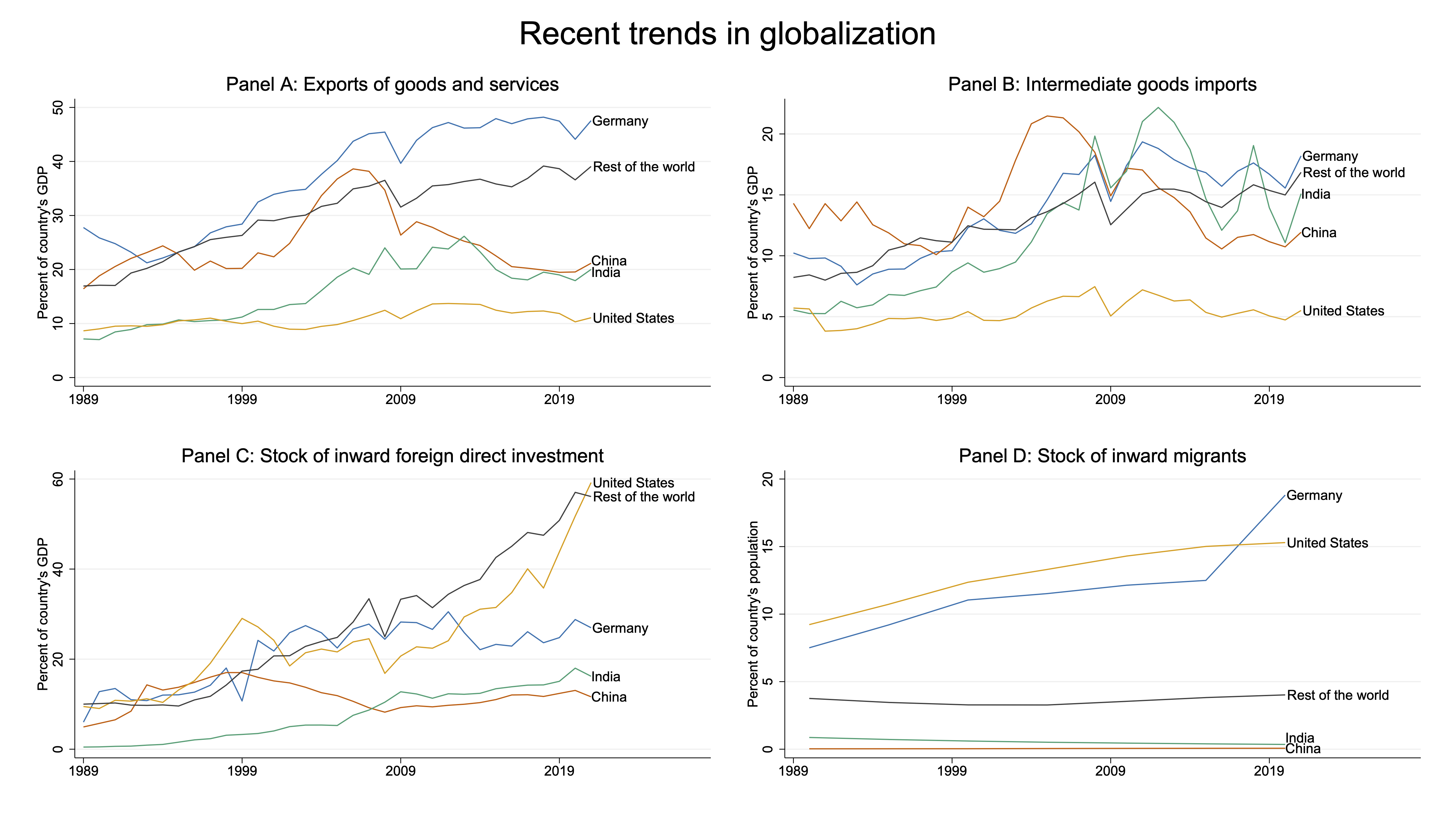
description: I created most of the figures in this paper, which discusses recent trends in globalization, policy environments, and trade. This was a fun project because it required compiling different data sources and identifying which trends to highlight. I used STATA to do the data cleaning and visualizations.
This is the first figure in the paper, which shows four distinct outcomes related to globalization. Panel A and B show exports of goods and services and intermediate goods imports respectively. Goods data were from UN COMTRADE and services came from the WTO. GDP data came from the World Bank. Intermediate goods were defined using the UN’s Broad Economic Categories assigned to the Harmonized System (HS) product codes. Panel C uses data from UNCTAD STAT variables on inward and outward flows and stock of foreign direct investment. Panel D uses UN DESA data on International Migrant Stock.
what i learned: There’s a lot of legwork behind making a visualization and you don’t always need more data to show something meaningful. This started as a bunch of rows of trade data (which are often defined at the reporter country-partner country-product-year level) collapsed into an even smaller dataset before plotting. When I first made these plots, I questioned myself “is this all the data I need? am I missing anything?” when I went from millions of observations to a few hundred. But in fact, this made the process easier. I saved these small data sets so I didn’t have to re-run the full, time-consuming code which pulls and cleans all the trade data sources. The resulting plots are simple and effective in driving the discussion of the paper.

appears in: “How to End the COVID-19 Pandemic by March 2022” by Ruchir Agarwal and Tristan Reed
tools: STATA, QGIS
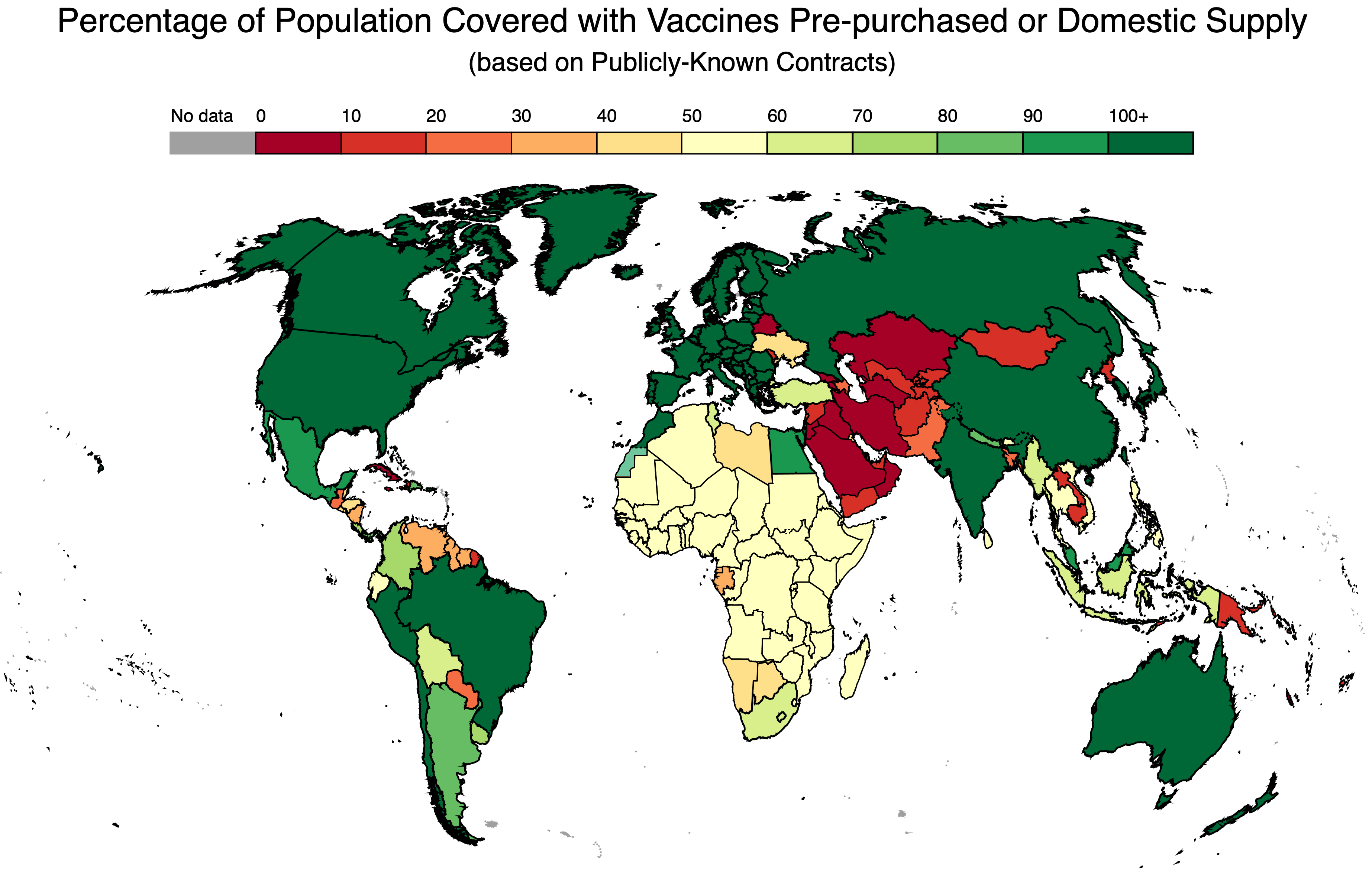
description: I created this plot showing the estimated percentage of populations that are covered by COVID-19 vaccines (based on 2 doses). This was a very relevant project to work on during the pandemic. From a quick glance, it shows that relatively rich Western countries ordered more than enough vaccines to cover their populations, but other countries – particularly in Sub-Saharan Africa and Central Asia – did not.
I used QGIS to get the correct projection for the world shapefile and STATA for the data merging and visualization (yes, a choropleth map in STATA!)
The data behind this map was a collection of contracts of COVID-19 vaccines that were pulled from COVAX, Duke Global Health Innovation Center, and news sources and was updated daily. This was a project on a tight timeline and I remember working on it and getting requests to remake the map daily as data was coming in with new contract information.
what i learned: Reproducible code is a blessing. Now, I knew this fact prior to working on this project – in school they drilled the importance of documenting and being able to run and reproduce your code – but here it became very important. As I mentioned, I would get new data every day (or every few hours even), and I needed to update the plots accordingly. My supervisors also wanted to be able make changes where necessary and setting up and documenting the STATA code that reads the shapefile (and deals with geospatial operations), merges the new data, and creates this plot made it easier for all of us.

appears in: “Trade Liberalization and Labor Market Institutions” by Leonardo Baccini, Mattia Guidi, Arlo Poletti, and Aydin Yildirim
tools: STATA, ArcGIS
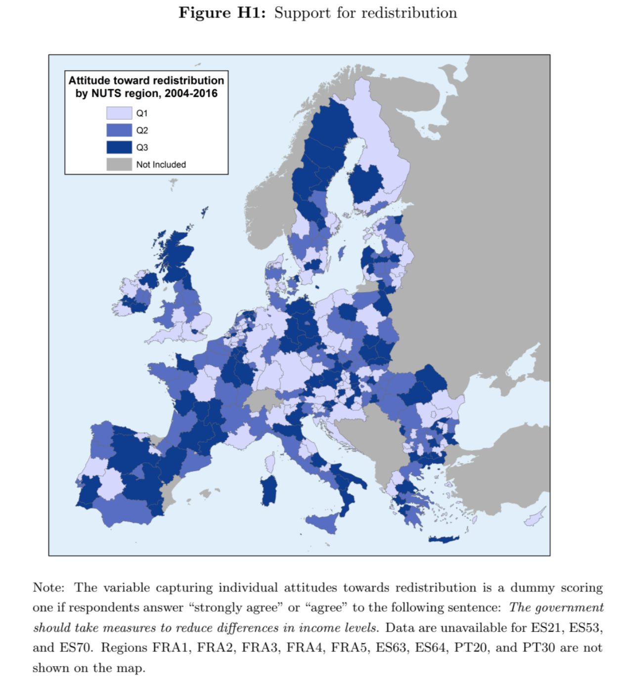
description: This map shows opinions for redistribution across the NUTS-2 (which stands for “Nomenclature of territorial units for statistics” a.k.a. administrative regions) in the European Union from 2004-2016. This was made during my days as an Economics undergraduate student working as a research assistant in my spare time.
what i learned: Economists and political scientists use a lot of geographic data. My undergraduate background in Economics and Geography was very useful for this task. This was also during a time when I was still learning STATA and dabbling in the data and empirical research space outside of class, so I thank my supervisor for having patience and trust in me!
Even today, the economists I work with often request these simple, yet effective, choropleth maps to showcase variables in their data. Luckily, I’m trained in both econometrics and geographic information science to understand what’s going on.
bonus plot!

appears in: “Exploring the Effects of Rural Hydro-Electricity”, my undergraduate research project (not published)
tools: Excel, STATA
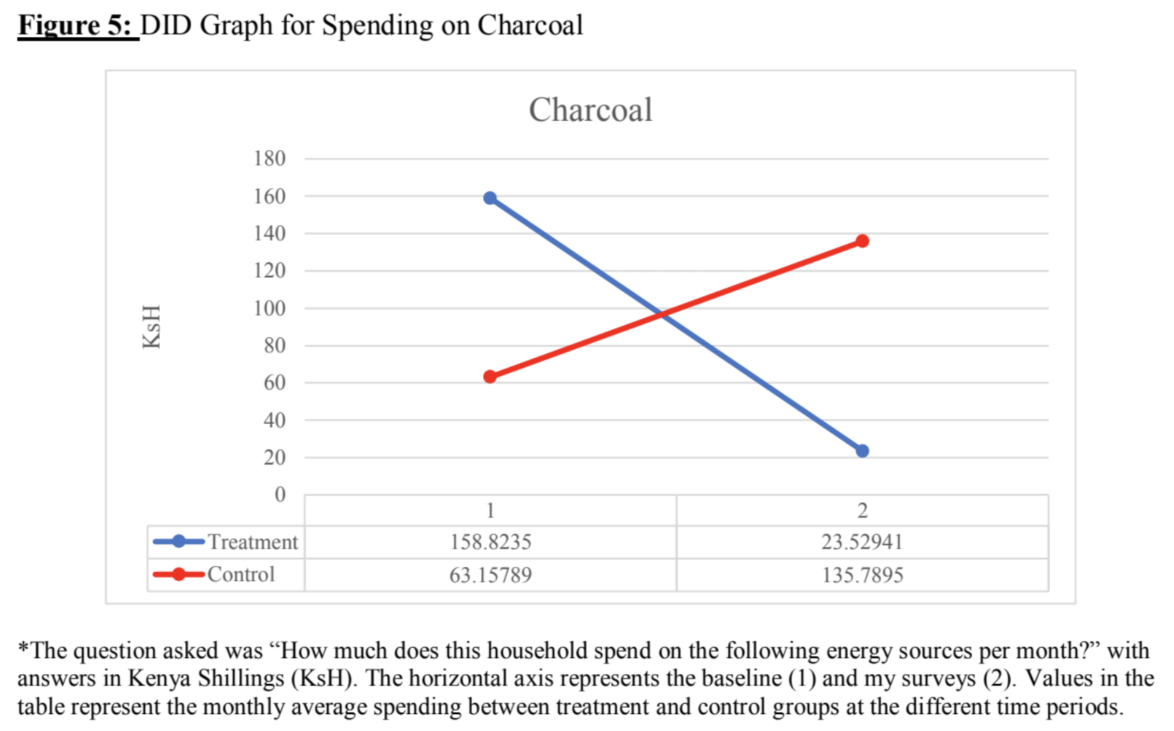
description: One of the first plots I made for an original research project. I had just spent the summer of 2017 in Kenya working in one of my professor’s labs, which focused on randomized control trials (RCT) for economic development. As an intern, I was encouraged to pursue my own research. The lab had a new hydro-electricity RCT set up and I wanted to look at the impact of electricity access on household socio-economic outcomes. I collected survey data data by visiting the households and did this (very simple) analysis with the guidance of my supervisor.
Overall, I found treated households who received electricity spent less money on buying charcoal as an energy source (opting for lightbulbs instead) and spent less on charging their mobile phones (which originally required a 20 minute motorcycle ride into the nearest town to charge at a store) compared to control households. Obviously, it wasn’t the most rigorous analysis, but as an undergraduate I was very proud of being able to apply what I learned in class to a real-life situation. I would definitely not consider this project as something ground breaking (please do not cite this in your papers).
I also naively did my analysis in STATA, but somehow opted to make these difference-in-difference graphs in Excel (yikes!)
what i learned: This research experience solidified my interests in development economics as a field, and later, informed my Masters research on an education RCT. I also learned that I should not be making plots in Excel, and proceeded to dedicate time to learn STATA.
I’ve come a long way from plotting in Excel to now being fluent in STATA and R and running more sophisticated analyses and making simple and effective plots. Over time, I’ve learned that my main interests are in how to use data to communicate research findings, or to tell a story. I hope to be able to do more of this in the future.