LGBTQ policy has improved, but could be better
code and tools: R, QGIS, sf, ggplot2
Existing as a lesbian, gay, bisexual, transgender, or queer (LGBTQ) individual is no easy feat. The wave of accomplishments in the 2010s with marriage equality and increased representation is being threatened by increasingly punitive policies.
The American Civil Liberties Union, a non-profit, is tracking nearly 500 bills designed to erase LGBTQ representation in the United States. In Spring 2023, Italy’s newly elected far-right government limited parental rights for lesbian couples. Uganda recently passed a law calling for the death penalty for acts of “aggravated homosexuality.” Neighbouring Kenya wants to follow suit. For every action it appears there is an unequal and more punishing reaction.
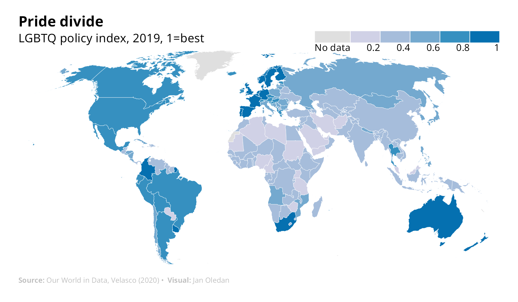
LGBTQ policy covers a spectrum of laws and equally diverse population. In a recent data set, Kristopher Velasco of Princeton University compiled 18 distinct LGBTQ related policies into a country-level index from 1991 to 2019. Progressive policies, such as marriage equality or banning conversion therapy, increase the index. Regressive policies, like a death penalty for same-sex sexual acts or propaganda laws, lower it. Values close to 1 represent countries with the most inclusive LGBTQ policies.

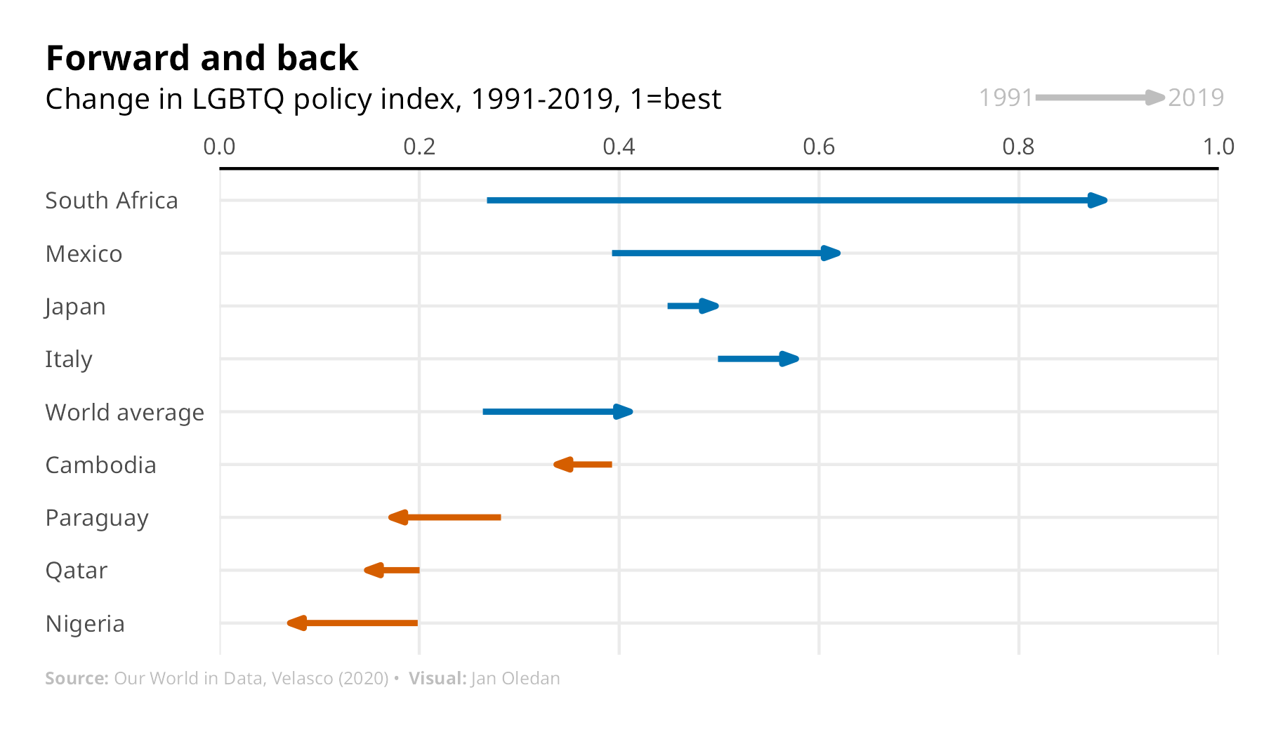
Relatively rich and democratic countries of Western Europe, North America, and Oceania occupy the higher end of the index in 2019 (the latest year in the data), boasting favourable environments for LGBTQ populations (see map). Latin American countries are not too far behind. Brazil, Colombia, and Argentina—the three most populous countries in the region—legalized same-sex marriage in the 2010s. The region also made great strides in recognizing gender-identity expression laws, which allow transgender individuals to make legal identity changes with ease. South Africa, whose index of 0.89 is among the top 5 globally, stands out on its continent as the only African country where same-sex marriage is legal. It also boasts the largest improvement (+0.62) in LGBTQ policy from 1991 to 2019.
Countries also exhibit slow progress or backslide, favouring the status quo or implementing more severe laws. East Asian countries such as South Korea and Japan, which have anti-discrimination employment laws limited to some metropolitan areas, hover between 0.4-0.5 on the index (see chart). There is still a lot of catching up to do, with over 118 out of 193 countries (61%) scoring below the 2019 world average.

Nigeria’s decline from 0.20 to 0.07 reflects its punishing environment for LGBTQ individuals. In 2014, its government passed the Same-Sex Marriage Prohibition Act aimed at criminalizing same-sex activity, including public affection or even civic engagement with LGBTQ organizations. Public opinion is also bleak. In a recent analysis by Pew Research, 97% of survey respondents opposed same-sex marriage in the country. It is among the 36 countries concentrated in the Middle East and Africa which eroded any remnants of LGBTQ policy over time.
LGBTQ rights have improved globally since 2019. Mexico became the 34th country to legalize same-sex marriage at the end of 2022. South Korean lawmakers recently ruled in favour of a same-sex couple, allowing them to list each other as dependents in the national health insurance scheme. Activists in the country are hoping this sets a precedent for change. It is easy to understate that LGBTQ rights have improved in the past three decades. 70 out of 193 countries (36%) in the data increased scores over time, albeit at a slow and steady pace. Some have yet to improve. Many LGBTQ individuals are familiar with this process—like coming out, change takes time.
Reflections
This is a section where I write out my thought process and questions while working on this project:
Let the data dictate the story! Or is it the other way around?
Coming from an academic background, I’ve always learned to let the theory drive the data. Data journalism pieces that I admire and tried to mimic in this exercise let the data drive or support the story. This was an interesting exercise because it challenged my current way of thinking.
I made one version of a scatterplot which compares GDP and the LGBTQ policy index, to see if richer countries have better policy environments. Now, my economics education taught me that there is always something beyond a simple correlation. I wasn’t sure how to answer or support this observation, or if it was a fair comparison to make. What characteristics or experiences of rich countries made it so that they have better LGBTQ policy environments? This is where theory comes in - but of course, I was trying something new in writing a short and informative data piece.
Finding the best way to plot the data is an art in itself
There are so many ways to visualize this data set (in fact, any data set). The policy index values in the original data are from -5 to 13, but I played around with different versions of these values and plots. First, I settled on a plot of the absolute change from 1991 to 2019 - but then I would lose out on meaningful variation over time. I made another version highlighting selected countries and their policy values at equal breakpoints (every 14 years – 1991, 2005, 2019), but it got too messy even with greyed out lines for the non-highlighted countries. I also made a version plotting percentage changes, but plotting a 200%+ increase seemed non-intuitive. (Side note, I discovered that it’s tricky to compute percentage changes when you have a negative to positive scale.)
This is where I had to be sure on what story I wanted to tell – and where my academic rigour in finding all feasible ways to tackle a research question comes in handy (and also became a challenge). I settled on highlighting the current state of LGBTQ policy as of the latest year in the data (2019), and then focusing on a few countries to show and discuss changes over time. I also settled on transforming the data into a normalized scale between 0 and 1 because it is easy to interpret (higher number better, low number bad!)
R is a lot more flexible than I remembered
In my recent work, I’ve used STATA for data analysis and visualizations. Whenever I switch between the two languages, I make an internal translation of what a certain command or syntax is. For example, generate in STATA is mutate in R, or STATA is line-by-line code, in R I can use pipes and functions. There are a lot of resources for R out there—even more than STATA—and whenever I had an idea of what I wanted to do, a simple search showed that I wasn’t the only one who thought of and struggled in implementing an idea (special thanks to StackOverflow and the 3 Minutes Wednesdays newsletter by Albert Rapp!)
Thinking of a witty title and informative subtitle is tricky and fun
I don’t know how the folks at The Economist think of witty titles so often, but I commend them for it. Not kidding, I spent idle time during random parts of my day thinking and re-thinking titles. Maybe I’ll get better as I keep doing these projects.
Thanks for reading all this way! I hope to practice more of these short data journalism style of posts and more informative data deep dives. Of course, any feedback is appreciated.